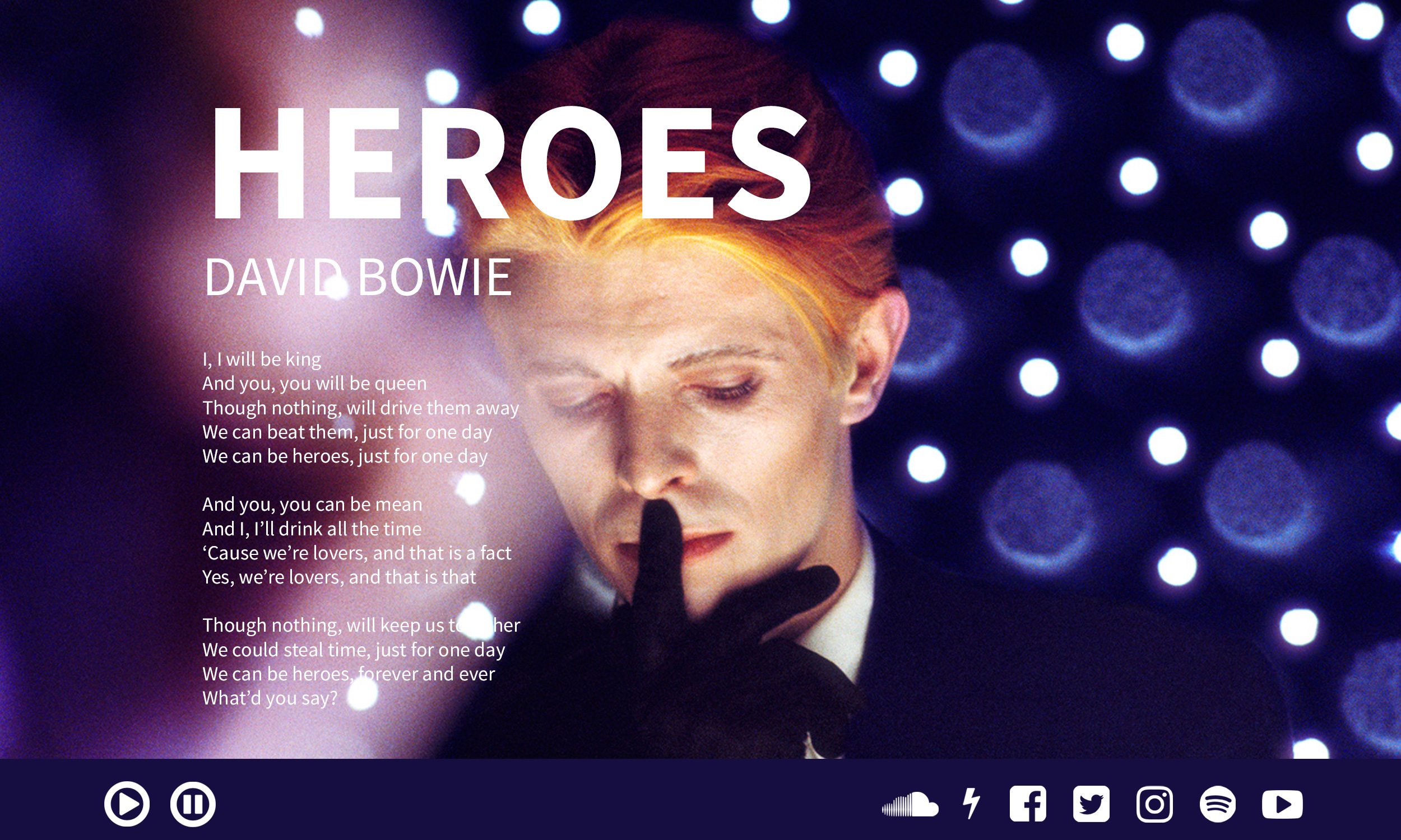
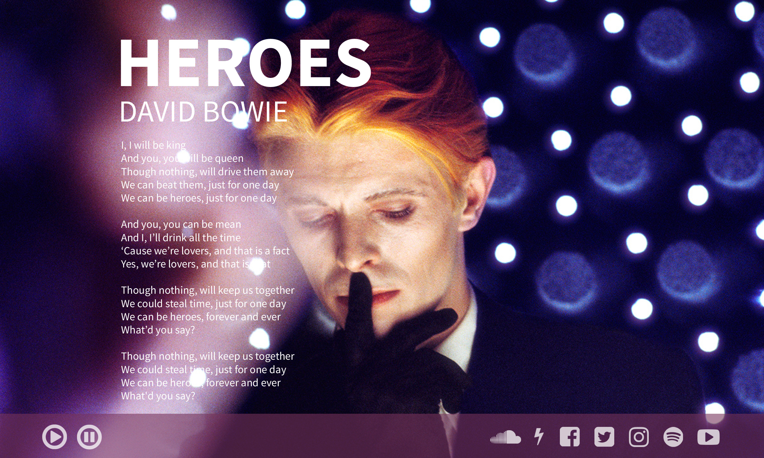
My improvement plan includes: changing the size and top padding of the title in order to get more info above the fold of the screen; setting larger padding on the left side, so the lyrics do not clash with the play or pause buttons on the menu bar; changing the color/transparency of the bottom menu bar as well as the social media buttons, so it does not distract the viewer's eye from the main content; and set a fixed width for the lyrics, so it scrolls over the floating background image without appearing behind the transparent media bar. The partner that gave me feedback was Sabrina Roberts.