Feedback for Devon's postcard triptych
by Esther An
Concept
- The up-close, funny photos of happy dogs are obviously chosen with intention, but I do think that this concept needs to be fleshed out.
- The fonts should be uniform throughout - the first one gives off a soft, delicate feel because of the light weight and the opacity.
- I think the bolded type for the last one fits best with the overall concept--maybe you could even use a really obnoxious font like Comic Sans.
Structure
- The visual priorities are obviously the dogs' faces.
- I think the type is pushed too much towards the bottom - I don't think you should be afraid of allowing the text to go on top of the dog's face.
- You should add quotation marks and the speaker's name on the first one as well. If there is a reason as to why the first one doesn't have these (and are slightly transparent), make it more obvious!
Aesthetic
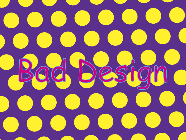
- Again, I think you could go totally crazy with your concept and make it look like it has really bad (but totally intended) design.
- Something like this: